Kitchen Refresh
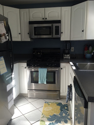
Happy Friday everyone! I'm back today to share my kitchen update, which was a fun and exciting project for me to work on. To be honest, the kitchen was one of my favorite rooms in the house when we first looked. Sure, it's not huge, but the white cabinets, dark gray countertops, and blue walls were all right in my style! I didn't need to make any huge changes to this room, but did a few things to update it and make it look nicer without having to make any big purchases.
Here's a look at the before, when we first looked at the house...you can even see the flyers on the counter.
My first step was one that I made right away and made a huge impact immediately - switching the cabinet knobs. This was really simple, and I loved how the basic black knobs made everything look more modern and sleek.
I repainted all of the walls the same color as the bathroom (Sherwin Williams Gibraltar) since I still had plenty left over. I also decided to paint an accent wall in our "dining area" white, to match the accent wall in the living room. I love how this makes it pop a little bit and avoid making the room look too dark and smaller than it already is.
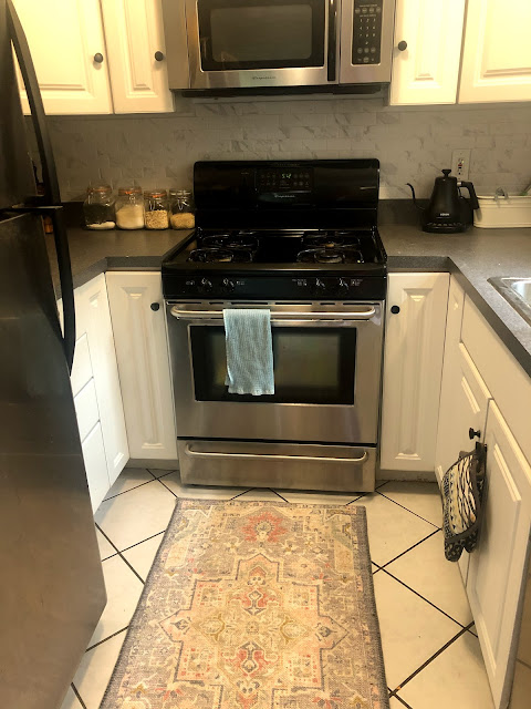
After painting was over, I installed backsplash. I chose a porcelain tile with a marble pattern (Satori Regent Carrara Marble) to add a little interest on the walls without being too over the top. I've always loved how marble looks, and I like that this material is easy to care for while still having that classic look. The tiles were really easy to install- just make sure to take your time and make sure everything is lined up as level as possible! (and yes, a beer was completely necessary).
I finished it off the next day with some plain white unsanded grout- this helped conceal any mistakes I made since the tiles are mostly white. Thank goodness for grout is all I have to say...
I touched up with some white paint under the cabinets and around the outlets, just to make any gaps less noticeable. Since this was our first time tiling it definitely wasn't perfect, so this helped everything blend a lot better. One mistake that I made was buying the wrong kind of bullnose tile for the edges (it was a slightly different variety from the same company and looked awful when I tried to install it together!). Our tile actually didn't come in bullnose unfortunately, so I tried to blend it a bit with caulking around the edges to seal it in. After I installed everything I found out about tile edging that would have looked better, but of course you had to install it behind the tile. Lesson learned for next time!
I added some new accessories - a rug and lazy Susan - as well as repurposed some other decor to spruce everything up.
In the dining area, I added a table runner and moved over my wooden slab (which got replaced by the lazy Susan for my liquor bottles) and topped with a succulent and seasonal candle from Trader Joes.
My last step to finish this off was to hang some pictures in the dining area. I was originally planning on a gallery wall, but Dan wasn't a fan so I just hung a few up. I love how they look- these are all pictures that Dan's taken during our trips and I'm happy they're finally out where people can enjoy them.
And here's the final before and after! SOOO happy with how everything looks and proud for doing it all myself!


Are those plants hung on your dining room wall? How did you do that???
ReplyDeleteAnd I love the rest of your updates... it looks so clean and fresh!
Good eyes (from a horrible picture haha!)!! I got the Ikea Fintrop system-2 of the rails, 2 utensil holders (the smaller buckets) and 2 condiment stands (along with hooks for each piece). It's super easy to mix and match the design to fit your space! I tried to do real plants but that area doesn't get enough sun, so I just put in some foam, stuck in fake succulents from the craft store, and added moss on top to hide the foam. It's held up great for the past 4 years!
DeleteThank you! I suspect I could order that same system from Ikea. I have limited light in my apartment and want to make sure my plants can get enough of it - especially in the winter (in Wisconsin...). I do think it's hilarious that you augmented with fake succulents. Smart - very smart! Thanks again.
ReplyDeleteGood luck!!!
Delete